Deetken Impact Website Re-Design and Branding
PURPOSE
In terms of money invested, the Impact Investment sector has been growing at a radical rate over the past three years compared to traditional capital-return investment funds. This increase in demand for impact investment options is not unrelated to the coming of age of the “Millennial Generation” – the generation that represents the most technically immersed, digitally savvy, environmentally and socially conscious segment of the population.
This presented a perfect opportunity to begin incorporating a “Millennial” marketing focus within the Deetken Group’s Impact Investing sector.
The purpose of the Deetken Group’s website re-design was to conscientiously – through both design and content – target this growing population of impact investors, while at the same time maintaining the credibility and stellar reputation that they have developed with their current asset management clients.
Additionally, Deetken Impact was being overshadowed to some extent by Deetken Group. The two wings of the business have separate functions, yet that separation was not clearly defined through their brand identities and in the existing umbrella site. The purpose of a standalone website for Deetken Impact was to, along with concerted social media efforts, define Deetken Impact as a stand-alone brand.
Key Areas Where the Deetken Impact Site Was Improved
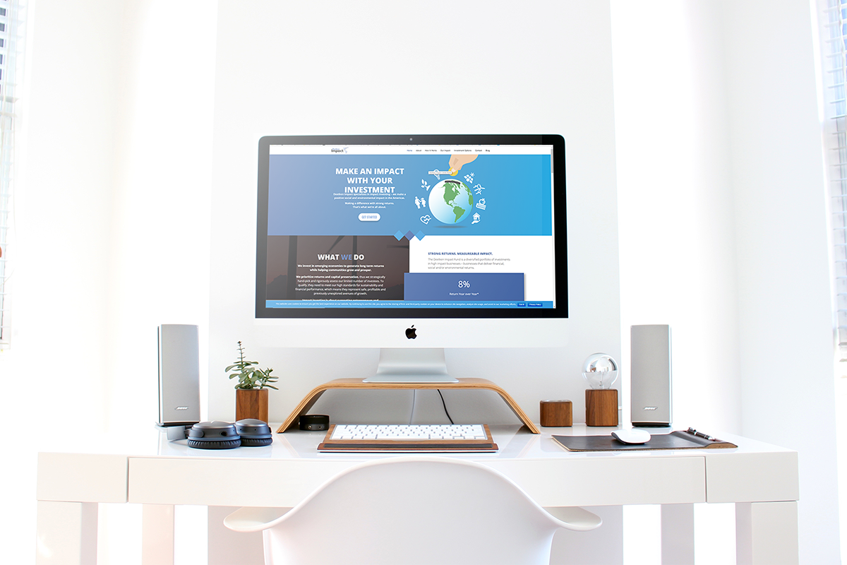
Streamlined Content
We condensed information to make it more easily consumed by the reader. We simplified text and created a clear, easy to follow sight structure.
Purposeful Funneling
Visual Marketing
User Interactivity

Custom Graphics
factored greatly in creating a memorable visual representation of the Deetken Impact brand. The company logo remains similar to the Deetken Group logo, solidifying their relationship as sister entities. However the “Globe Bank” represents what Deetken Impact does, and has become their go-to messaging graphic both on the web and off.