Lavi Co. Logo Redesign

Background and Goals

Blue is the preferred color of men and women. It’s associated with peace, tranquility, and reliability. Blue provides a sense of security, and stimulates productivity, and encourages a sense of dependability. The most common color used by conservative brands looking to promote trust in their products. Grey, as a neutral color evokes a sense of calm, and balance. Together they create a color scheme that is both conservative yet contemporary without representing a fad. These colors were chosen together to evoke a sense of dependability, timelessness, ease, and trust in the eyes of a potential client.
Concept 1
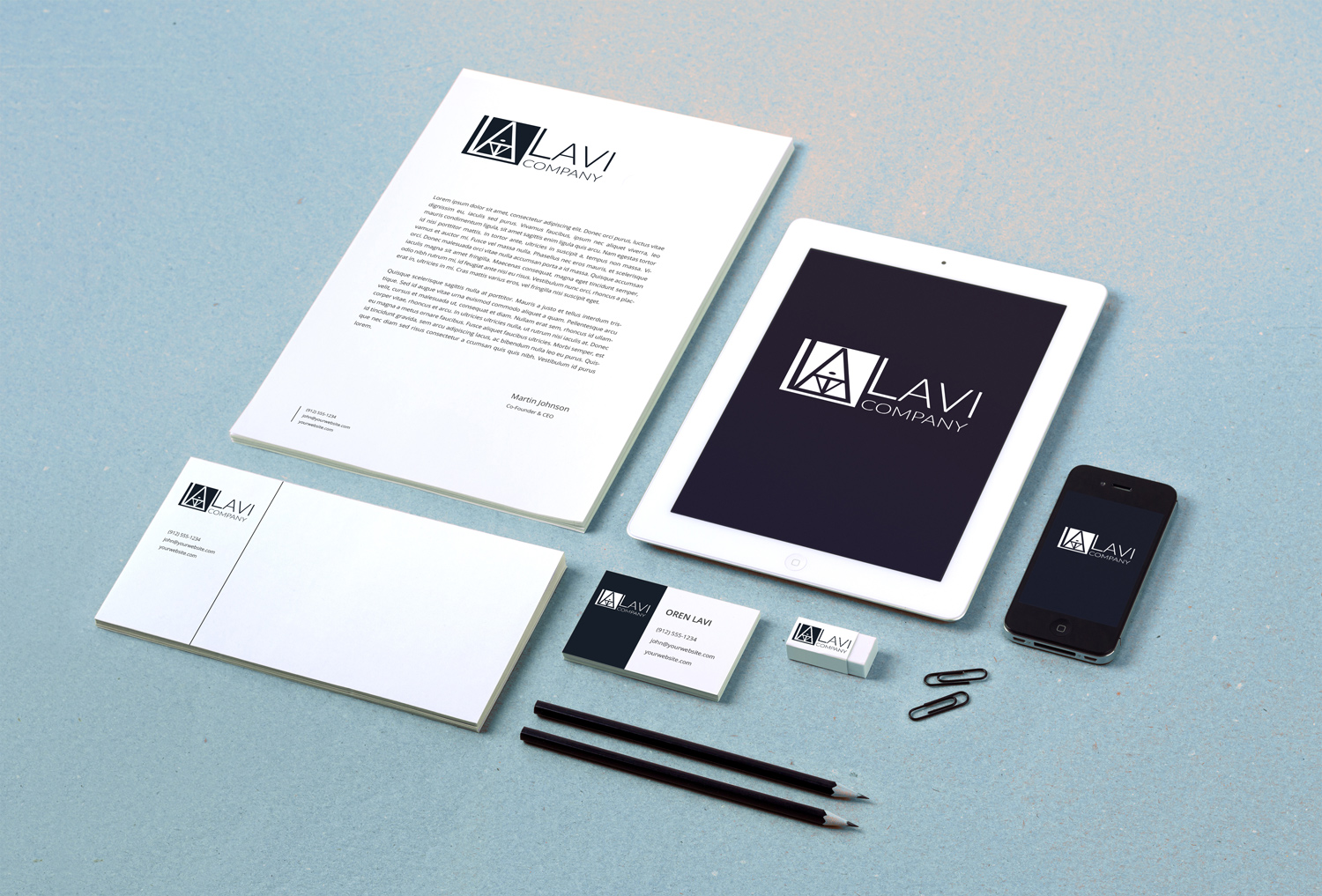
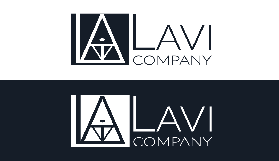
Inspired by the name “LAVI”, this concept is composed of the letters L, A,V, i, creating a strong, unique graphic logo. The graphic itself has an architectural quality, referencing the attention to detail and quality craftsmanship that the Lavi Co. brand represents, while the fonts chosen for the name are minimalist and modern.

Concept 2
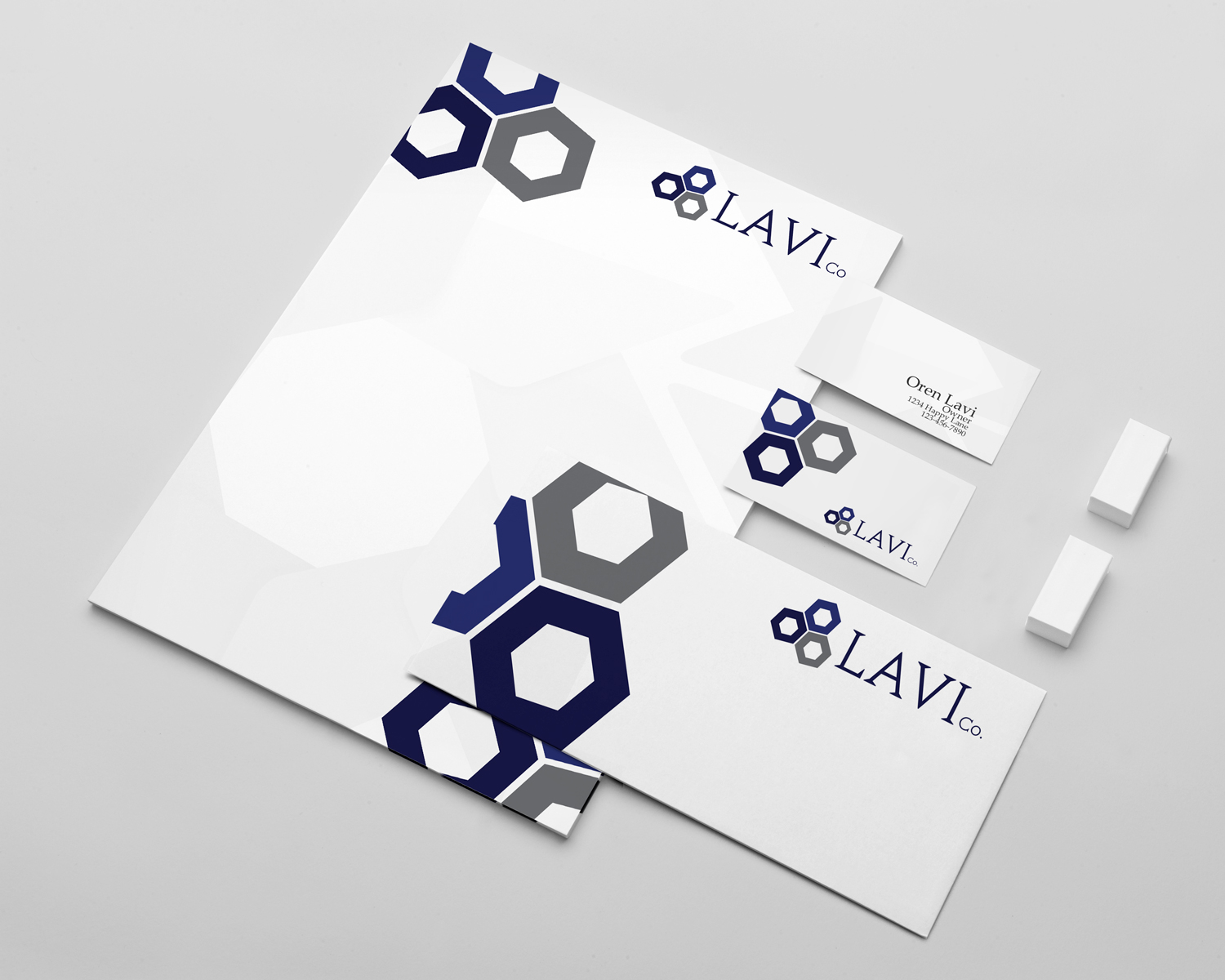
This logo design is a more industrial-take on the Lavi Co. brand. The three hexagons can be seen to represent the fittings that hold a building together (i.e. nuts), and their arrangement signifies cohesion, and order. The font is a very strong serif, which presents the brand as an authority in the industry.
Concept 3
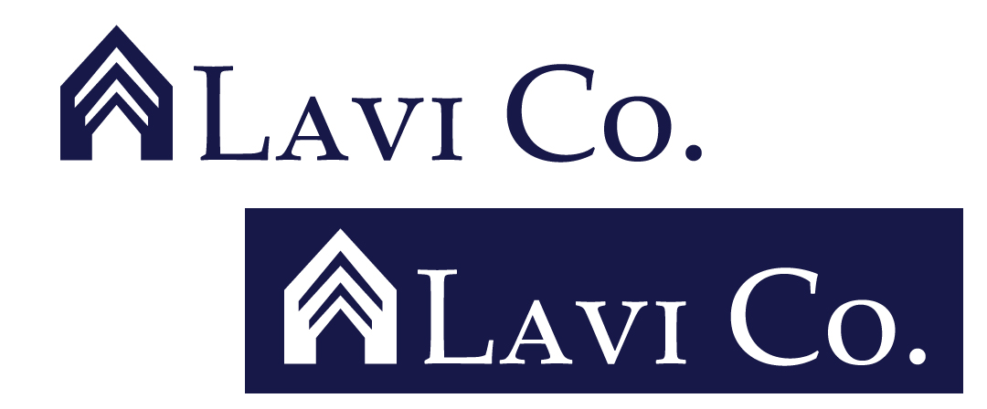
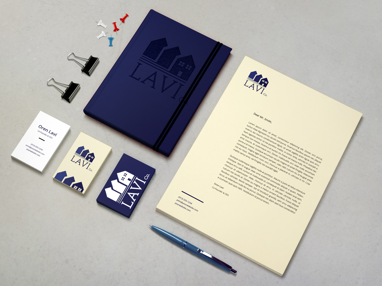
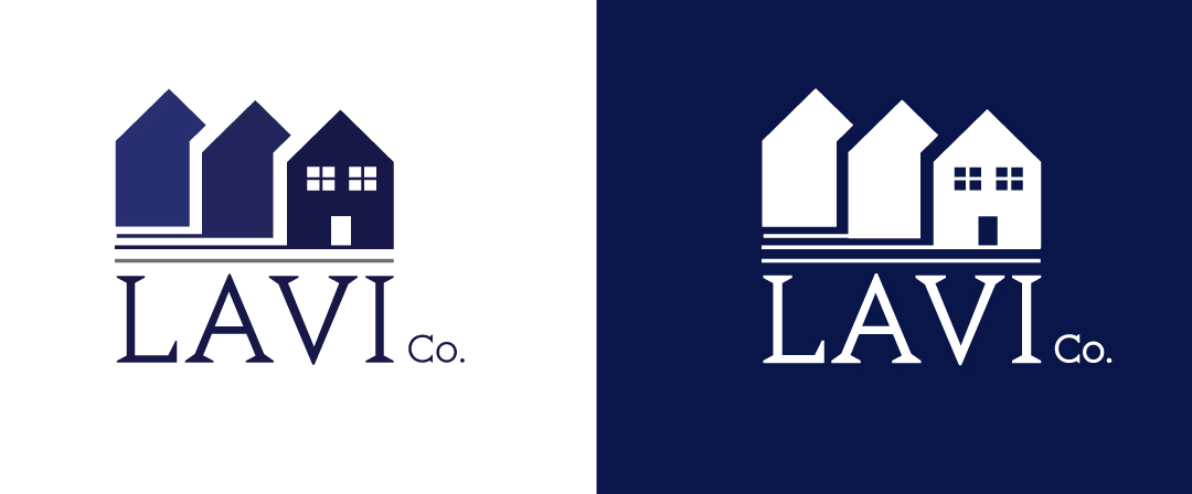
The basic “house” shape is the foundation of this concept, with three successively larger variations all coming together as one, representing the metamorphosis a home undergoes during a substantial remodel or rehab project. A fairly traditional graphic style coupled with a traditional serif font, presents a logo concept that implies longevity, and quality.
Concept 4
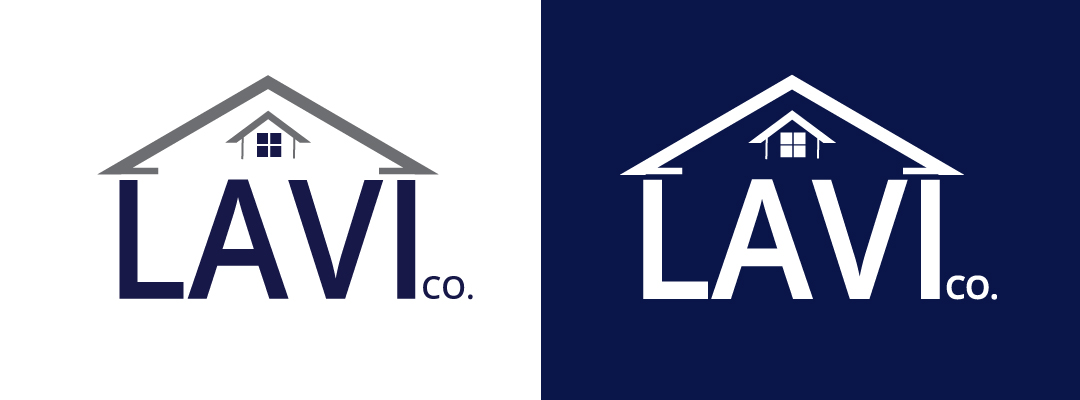
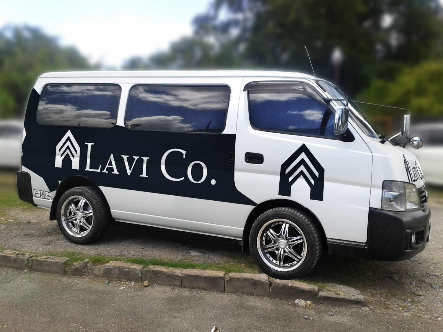
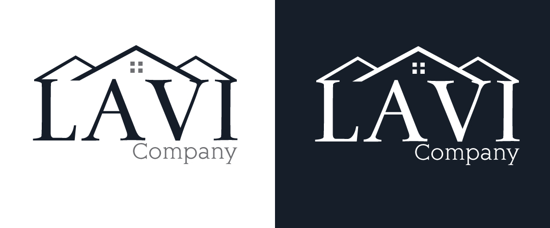
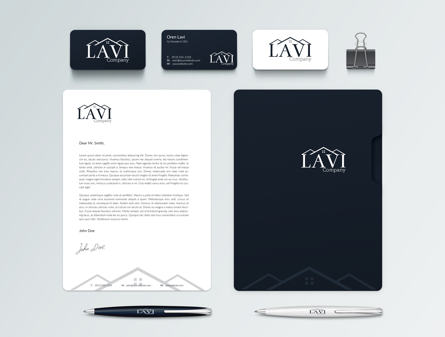
This concept has strong, clean lines that presents a professional, yet modern Lavi Co. brand, while at the same time giving a sense of ease, and calm through symmetry. The rooftop graphic can be used as a standalone branding element (as shown in the mock-up). The graphic itself creates a perfectly aligned “cap” to the Lavi name in the full logo, implying that Lavi Co. produces an impeccable finished product.
Concept 5
Concept 6
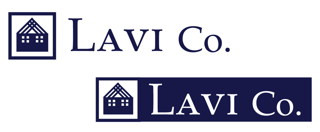
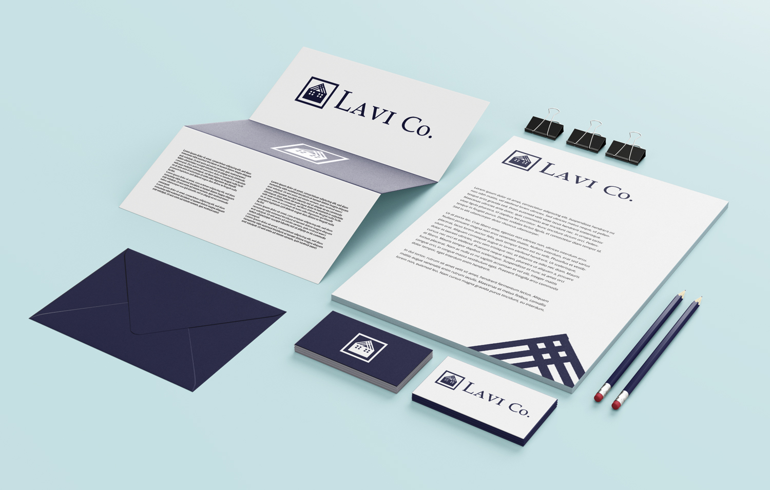
A beautiful combination of traditional serif style fonts, and a easily identifiable, yet unique graphic create a strong positive and memorable impression on the viewer. The graphic “home” is constructed of interlocking beams, signifying the art of design, as well as the strength and quality craftsmanship the Lavi Co. brand represents.
Concept 7

