Select Page

Close To Classy Rebranding

Original Logo

Background and Goals

Close to Classy blog is a wildly popular personal blog, that is funny, sentimental, creative, whimsical… full of personality. Sadly, the branding did not reflect that. Jorrie came to me looking for something that was “perfectly imperfect” “not fussy, but feminine” and “comfy chic”.  Additionally, she was looking for something that:

Is a little whimsical, clean, feminine without being gushy.

She could incorporate into her banners, for both my Facebook page and her blog, and will stay consistent as her brand, even if she changed banners or themes down the road. For that reason she want something text-based, classic and simple–but unique. She was not opposed to a single graphic with text, but didn’t really have a clear idea about what that graphic should be.

She wanted a font that was “Cursive and Sassy”. 


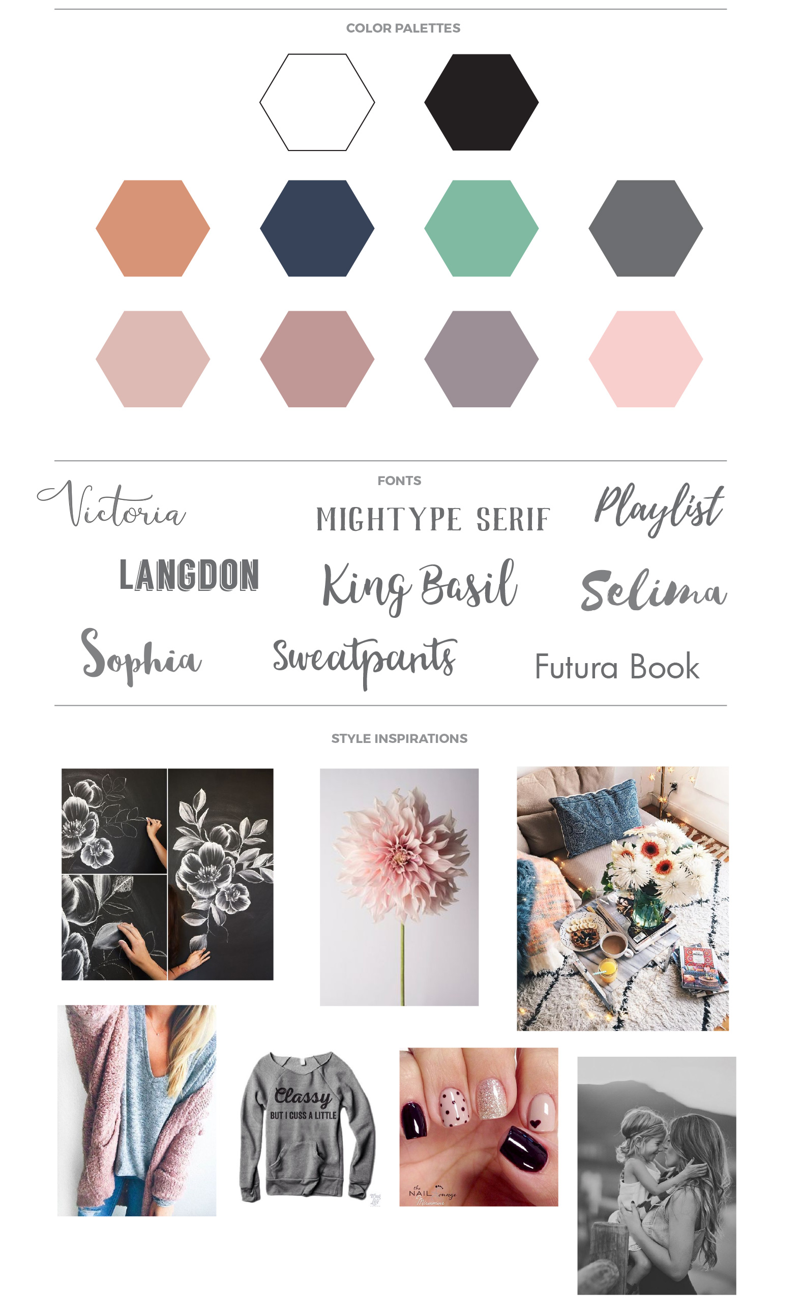
Inspiration Board

based on our discussions about what Jorrie needed and hoped for with her rebranding, I developed the inspiration board below to guide me.
Final Design

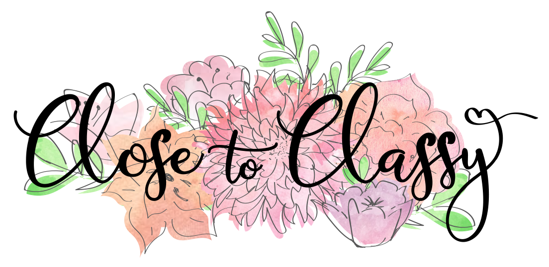
Ultimately, Jorrie fell in love with a design featuring hand drawn flowers I created with a Wacom tablet featuring a watercolor-style fill that was purposefully “outside the lines”, making it look like a slightly imperfect textile print. It is a “perfectly imperfect” logo.
Concepting got us there

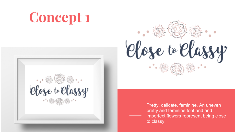
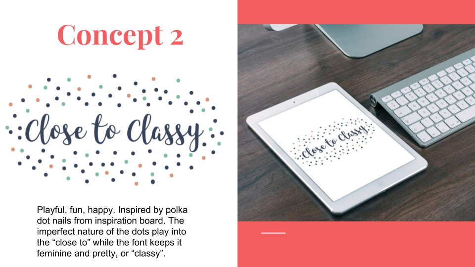
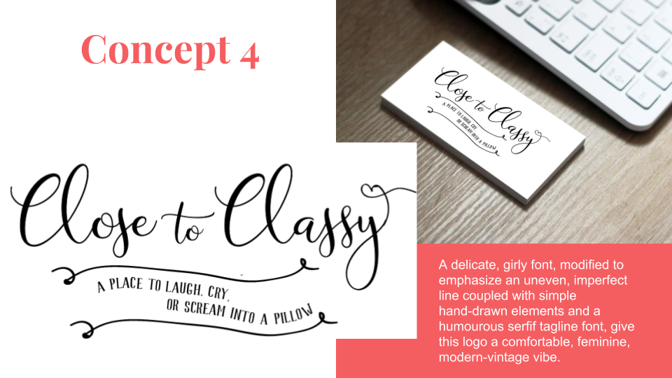
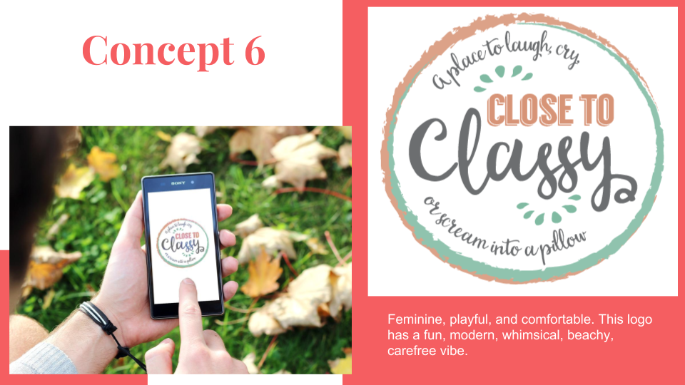
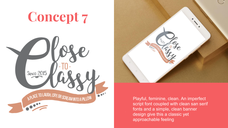
Here is a collection of some of the logo concepts I presented prior to finalizing the new design.